Mobile Responsive Web Design
Understanding What Mobile Friendly Really Is...
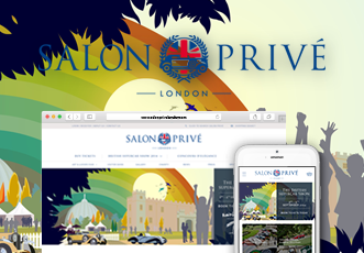
Your website may need to be displayed on smaller devices (Mobiles & Tablets) in addition to Desktops (PC, Mac or Laptop). There are two solutions to consider.
Mobile Website
A mobile website is developed as a new separate entity (a new copy of your desktop website). This will need its own domain (typically "m.mywebsite.com"). The site will be optimised only for mobile screens and load on detection or specific URL load. In this way you can switch between mobile and classic on your chosen device. Google is an example of a site that uses device / browser detection to display the appropriate site. You will see different versions loading for mobile vs desktop.
Is Your Site Awesome?
Check out the Google Mobile Friendly Test to analyse your site. Have a look at our Portfolio for examples of mobile friendly sites and get in touch to find out how we can help, with your existing or new web project. It is important to consider mobile devices, especially with #Mobilegeddon that could mean mobile rankings being affected.
Our Services
Design
Concept Development
Responsive Design
User Interface
Icons & Illustrations
Art Direction
Design For Conversion
Development
Front-end & Back-end
Websites & Apps
E-Commerce
HTML5 / CSS / Javascript
Database Integration
API Development
CMS Integration
Mobile Friendly
Mobile
App Design & Development
iOS (iPhone & iPad)
Android
Windows Phone
Partnering & Consultation
Hosting
Project Management
Service level agreements
Web Analytics
Email Campaigns
Advice
Online Marketing
Search Engine Optimization
Online Advertising
Monthly Reports
Social Marketing
Remarketing
Lead Tracking
Ready To Start Your Project?
Get In TouchCase Studies